 Ómar Thor ÓmarssonUpdated
 B2B Websites are never finished
Why the best B2B websites are always evolving

TL;DR
Your website is not a set-it-and-forget-it asset. It's a living part of your growth engine. This guide shows why continuous website optimisation matters, how to use analytics to prioritise improvements, and simple ways to build a habit of shipping fast and learning faster.
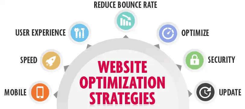
Why Continuous Optimisation Beats Big Redesigns
A B2B website is never “done.” The moment you launch it, visitor expectations shift, campaigns evolve, product messaging tightens, and a hundred other moving pieces change. Waiting for a once-a-year redesign means letting friction pile up in the meantime.
Plus, you’re sitting on gold. Every session, click, form fill or bounce holds a clue. B2B buyers are doing their research quietly, and your website is doing the heavy lifting, educating, qualifying and converting. Optimising every month (or week!) helps you stay ahead of what they want, need and expect.
What Continuous Optimisation Looks Like
Start small
Optimisation isn’t just about big A/B tests or full redesigns. It’s about fixing broken CTAs, improving headline clarity, speeding up mobile pages or reordering key blocks based on scroll data.
Use website analytics to guide the way
Look at session replay analytics, conversion funnels, bounce rates, engagement metrics, and AI-powered recommendations. These tell you exactly where visitors get stuck or lose interest.
Test one thing at a time
Changed your CTA? Keep everything else the same so you can see if it worked. Rinse and repeat. Real results compound when you keep things simple and focused.
Where to Start: Low Effort, High Impact
- Slow pages
Pages that load in over 3 seconds lose traffic. Run performance tests weekly and tackle the slowest offenders.
- Forms that don’t finish
If users are starting forms but not finishing, reduce the number of fields, rewrite unclear labels or reorder steps.
- Content with clicks but no conversion
Pages getting traffic but zero demos? Maybe the CTA is buried, the offer isn’t clear or the headline doesn’t match intent.
- High exit landing pages
Top landing pages with high bounce rates need help. Add trust signals, rewrite intros or reorder the first section.
Real-World Examples of Continuous Optimisation in Action
Sometimes the best way to understand what works is to see it in the wild. Here are a few examples of B2B companies putting website optimisation into practice without blowing everything up with a full redesign.
These companies all share the same mindset: the website is never done. It’s a living, breathing tool that gets better every week, not every two years.
1. HubSpot’s CTA Experimentation
HubSpot constantly runs micro-tests on button copy, CTA placement and form length. One simple tweak—changing “Get Started” to “Try It Free”—increased demo requests on their pricing page by over 10%. Small changes. Big upside.
2. Notion’s Landing Page Refinements
Notion doesn’t radically redesign its homepage every quarter. Instead, they evolve it. They tighten the copy, refresh hero images, and simplify page layouts based on scroll depth and bounce rate data. It’s a lesson in progress over perfection.

3. Gong’s Content to Conversion Play
Gong noticed high traffic but low conversions on a few high-performing blog posts. Instead of rewriting them, they added an inline “Watch a Demo” CTA and saw a lift in demo requests. No redesign needed—just smarter use of traffic they already had.
4. Webflow’s Performance Tweaks
Webflow invested in Core Web Vitals optimisation after noticing slower load times on mobile. They compressed assets, reduced render-blocking code, and improved TTI. As a result, they saw improvements in engagement metrics and mobile conversions.
Tools to Keep Your Optimisation Loop Running
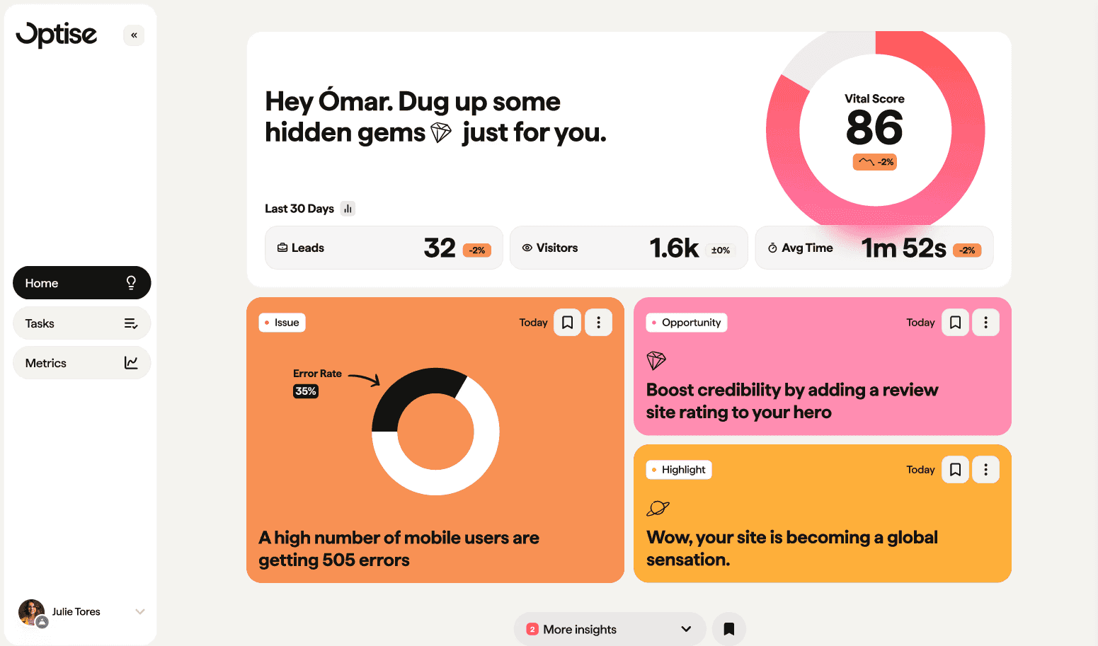
- Optise AI platform
Tracks traffic, sessions, drop-off points and recommends what to fix next, with real-time website analytics and AI-driven suggestions.
- GA4
Gives you raw tracking data on events, conversions and journeys.
- Hotjar
Reveals how people move through pages with heatmaps and scroll recordings.
- CRM + Marketing platforms
Use them to close the loop from visit to revenue, not just leads.
Build the Habit
- Weekly reviews
Spend 30 minutes reviewing site performance with your team. Pick one thing to improve.
- Monthly prioritisation
Use AI to surface highest impact opportunities based on traffic and conversion data.
- Shared dashboard
Track a simple mix of metrics: sessions, bounce rate, time on page, conversion rate, form completion.
Best Practices
- Optimise from actual behavior, not hunches
- Focus on one fix at a time
- Make testing part of your weekly rhythm
- Get marketing, product and sales looking at the same insights
- Don’t chase perfection, ship small improvements often
Conclusion and Next Steps
Your B2B website is a living, evolving channel. It’s not something you “launch and leave”, it’s something you grow with. Every tweak you make today compounds into better user experiences, higher trust, and more qualified leads tomorrow.
Want to see how your site is really performing?
Go to www.optise.com and run your site through our free trial. With AI-powered website analytics, you’ll get instant clarity on what’s working, what’s broken and what to fix next.
Smarter growth starts here. No guesswork required.
FAQ
Why is continuous optimisation better than redesigns?
Because big redesigns take months and often miss what’s already working. Ongoing optimisation lets you adapt fast, fix friction early and keep growing.
What if I don’t have time every week?
You don’t need hours, even 30 minutes weekly with the right dashboard and tools is enough to catch issues and plan improvements.
How do I know what to optimise?
Use website analytics. Look at your top pages with low conversions, form drop-off, scroll depth, and AI recommendations to know exactly what to tackle next.
Do I need developers for every change?
Not at all. Many improvements are no-code, headlines, CTAs, form edits, image swaps. For bigger fixes, batch your updates for dev time.
Ómar Thor Ómarsson
CEO & Co-founder