 Ómar Thor ÓmarssonUpdated
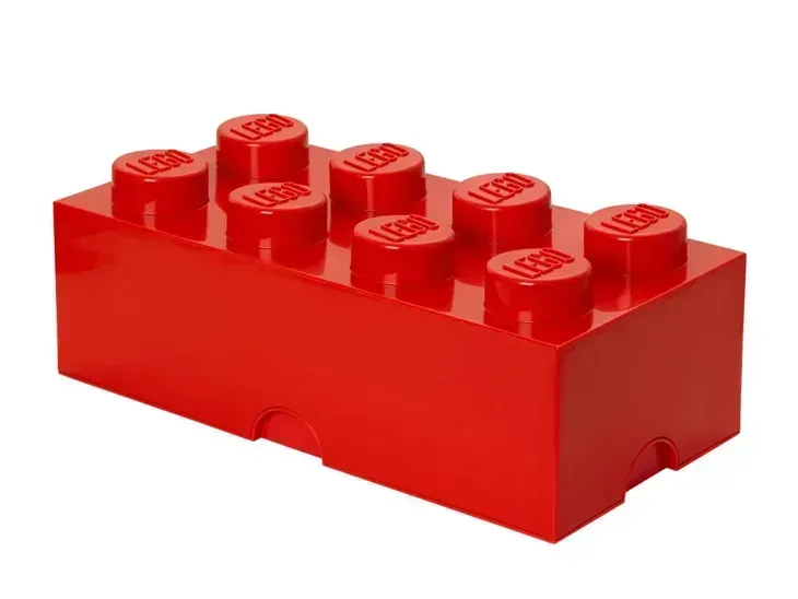
 A B2B website is kind of like building with Legos
When every piece clicks into place, your website goes from a pretty brochure to your best closer.
TLDR
A great B2B website is built like a Lego set. Every block serves a purpose, fits together in the right order, and builds trust with your audience. Miss a few, and the whole thing feels off. In this guide, we’ll break down the essential “homepage Legos” every B2B website needs, from a crystal-clear hero section to credibility, proof, resources, and conversion.
Why your homepage needs structure
Most B2B homepages look nice but don’t actually work. They have beautiful design, clever copy, and animations that impress designers — but confuse buyers.
A website’s job isn’t to win design awards. It’s to make your target audience trust you, understand you, and take the next step.
The best-performing websites are built intentionally. Every section has a role. Every line of copy builds confidence. Every click moves someone closer to “Yes.”
So let’s break down the building blocks that make it happen.
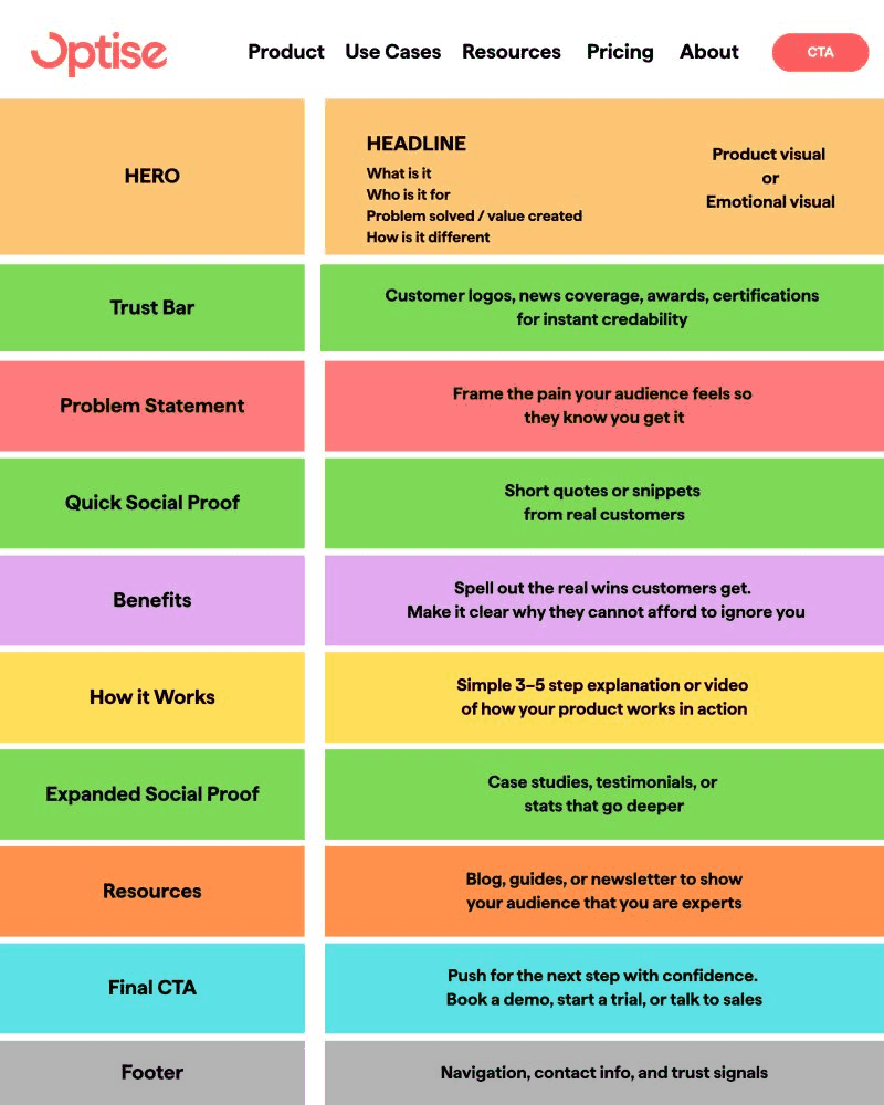
1. Start with a hero that actually says something
Your hero section is the first 5 seconds of trust. It should clearly say:
- What you are
- Who you’re for
- Why it matters
Add a short subheadline that reinforces the value or outcome. Skip the buzzwords. “We help B2B teams see what’s working on their website” beats “Revolutionising digital insights for next-gen brands” any day.
Pair it with a strong product visual or an emotional image that helps people feel the result of using your product.
2. Build instant credibility
Before you even start selling, prove you’re legit. Add a trust bar — customer logos, news mentions, awards, or certifications. It’s quick, visual credibility that says, “You can trust us.”
This tiny section does a lot of heavy lifting for conversions.
3. Show you get their world
This is your problem statement. One or two sentences that show empathy for your buyer’s pain.
When visitors read it, they should think, “They get what we’re dealing with.”
Back it up with a few short customer quotes or social proof snippets that sound real, not polished.
4. Lay out the benefits clearly
This is where most B2B sites lose people. They focus on features instead of outcomes.
Your benefits section should spell out the real wins customers get. Think:
- “Faster reporting, fewer headaches”
- “More qualified leads, less guesswork”
Make it obvious why your solution matters right now.
5. Explain how it works
Keep it simple. 3 to 5 steps max.
Use visuals or short blurbs that show how your product or service fits into the buyer’s world.
When visitors say, “Oh, that’s how it works,” they’re one step closer to clicking your CTA.
6. Back it up with deeper proof
You’ve earned interest. Now build confidence.
Include case studies, testimonials, or key stats that show your product delivers results. The more specific, the better: “Increased demo conversions by 32%” beats “Improved performance.”
7. Keep the learning going
The resources section keeps visitors exploring. Link to blogs, reports, or guides that show your expertise and help buyers learn on their own terms.
When done well, this section turns your website into an always-on sales assistant that educates while you sleep.
8. End with a strong call to action
Never leave visitors wondering what to do next.
Your CTA should be clear, confident, and action-driven:
- “Book a demo”
- “Start your free trial”
- “See your website’s performance”
Make it easy to take the next step — and back it up with a second, softer option like “Talk to sales” or “Get a walkthrough.”
9. Test, tweak, and keep improving
Building the right homepage is only half the job. The other half is testing.
- Use tools like Optise to analyse how visitors actually behave — where they drop off, what they click, and how well your story converts.
- Test your messaging with real audiences using tools like Wynter, and refine based on what resonates.
- Talk to sales to see how prospects interpret your website’s story.
The best websites are living systems. They evolve with your buyers.
Conclusion
A high-performing B2B website isn’t a mystery. It’s built brick by brick, clarity, credibility, proof, and action until everything clicks.
If your homepage looks nice but doesn’t convert, it’s time to rebuild it with purpose.
Start by checking your own site with Optise to see what’s working, what’s not, and how to make your B2B website your best closer.
FAQ
1. What’s the most important section on a B2B homepage?
The hero section. It tells visitors what you do, who you help, and why they should care — all in seconds.
2. What’s a trust bar?
A row of customer logos, press mentions, or certifications that prove credibility instantly.
3. Should I show features or benefits?
Benefits first. People buy outcomes, not features.
4. How long should a homepage be?
Long enough to build trust but short enough to keep attention. Every section should earn its place.
5. Do I need customer quotes or testimonials?
Yes. They add social proof and build trust faster than anything you can write yourself.
6. What’s the biggest homepage mistake?
Unclear messaging. If visitors can’t understand what you do in five seconds, they leave.
7. How do I make my homepage convert better?
Clarify your story, simplify navigation, and add a strong call to action.
8. How often should I update my homepage?
Review it quarterly. Buyer behavior and market trends change fast.
9. What tools can I use to test my homepage?
Use Optise for analytics insights and Wynter to test your messaging with real audiences.
10. What’s the goal of a homepage?
To make visitors trust you enough to take the next step — click, sign up, or talk to sales.
Ómar Thor Ómarsson
CEO & Co-founder